Recently a coworker asked my help with a map he needed to complete the slides of a presentation. He wanted three maps of a specific province of the Dominican Republic, disaggregated by municipality.
When he ask for it, I immediately took it as the perfect opportunity to complete my shift from rgdals and tmap packages to sf and ggplo2 for maps visualization. The package sf provide spatial objects with the structure of a data frame where the polygons are contains in a list-column, making the use of spatial data more intuitive for the user. On the other hand, ggplot2 is ggplot2.
Since I already had the shapefiles and he gave me the data to plot, it was only about loading every file and creating the visualizations. Fidel was very specific about the details of the maps, sending me a list of RGB colors for the fill, the outline and the background of the plot.
packages
library(sf)
library(tidyverse)
library(ggrepel)
library(scales)
The data
The link to the shapefiles of the Dominican Republic is here, just download and place these 7 files in a folder and you’ll be ready to start. There are different files because each component of the spatial data comes individually. If you want to know more about this read this article.
The two demographic variables to plot are the province’s population and the number of people in working ages. He got this data from the National Statistic Office.
# reading the shape files
map_municipio <- st_read(
  dsn = "/cloud/project/mapas_rd/shape_files/MUNCenso2010.shp"
  )

# Demographic data of Puerto Plata
datos_m_pp <-  structure(
  list(
    municipio = c(
      "Puerto Plata", "Altamira", "Guananico",
      "Imbert", "Los Hidalgos", "Luperón", "Sosúa",
      "Villa Isabela", "Villa Montellano"),

    population_2018 = c(
      164494L, 19550L, 6562L, 22855L,
      13096L, 17059L, 51386L, 17790L, 20430L),

    pet = c(
      199557L,37492L, 9874L, 27504L, 16170L,
      20914L, 17027L, 9232L, 10863L)
    ),
  class = "data.frame",
  row.names = c(NA,-9L)
  )
We already have the sf object map_municipio in our environment, containing all the polygons of the country’s municipalities in a variable call geometry and a few other variables with identification codes for each area, like the province, region code and the name of the municipality.
glimpse(map_municipio)## Rows: 155## old-style crs object detected; please recreate object with a recent sf::st_crs()## Columns: 6
## $ PROV <fct> 01, 02, 02, 02, 02, 02, 02, 02, 02, 02, 02, 03, 03, 03, 03, ~
## $ MUN <fct> 01, 01, 02, 03, 04, 05, 06, 07, 08, 09, 10, 01, 02, 03, 04, ~
## $ REG <fct> 10, 05, 05, 05, 05, 05, 05, 05, 05, 05, 05, 06, 06, 06, 06, ~
## $ TOPONIMIA <fct> SANTO DOMINGO DE GUZMÁN, AZUA, LAS CHARCAS, LAS YAYAS DE VIA~
## $ ENLACE <fct> 100101, 050201, 050202, 050203, 050204, 050205, 050206, 0502~
## $ geometry <MULTIPOLYGON [m]> MULTIPOLYGON (((397122.7 20..., MULTIPOLYGON ((~The glimpse of this object let you see that it is a data frame. We can perform any manipulation over map_municipio, like filtering, joins, add new columns etc.
The data manipulation here consist of three steps:
- Filter
map_municipioto keep the rows corresponding to Puerto Plata, whichPROVcode is 18 - Add a new column call
municipiowith a to title transformation ofTOPONIMIA. We are going to use this new variable to join the demographic data and to label the plot. - Join
map_municipioanddatos_m_pptogether.
map_puerto_plata <- map_municipio %>%
  filter(PROV == 18) %>%
  mutate(
    municipio = str_to_title(TOPONIMIA)
  ) %>%
  left_join(
    datos_m_pp
) glimpse(map_municipio)## Rows: 155## old-style crs object detected; please recreate object with a recent sf::st_crs()## Columns: 6
## $ PROV <fct> 01, 02, 02, 02, 02, 02, 02, 02, 02, 02, 02, 03, 03, 03, 03, ~
## $ MUN <fct> 01, 01, 02, 03, 04, 05, 06, 07, 08, 09, 10, 01, 02, 03, 04, ~
## $ REG <fct> 10, 05, 05, 05, 05, 05, 05, 05, 05, 05, 05, 06, 06, 06, 06, ~
## $ TOPONIMIA <fct> SANTO DOMINGO DE GUZMÁN, AZUA, LAS CHARCAS, LAS YAYAS DE VIA~
## $ ENLACE <fct> 100101, 050201, 050202, 050203, 050204, 050205, 050206, 0502~
## $ geometry <MULTIPOLYGON [m]> MULTIPOLYGON (((397122.7 20..., MULTIPOLYGON ((~Visualizations
Before the plotting process, we will create four object with the hexadecimal color code for each element of the maps. I do it this way to avoid copying and pasting multiple times these codes.
 polygons_fill <- "#D9D9D9"
 polygons_line <- "#0070C0"
 text_color <- "#005472"


 polygons_fill_continuous <-  scale_fill_gradient(
   low = "#F5F5F5",
   high = "#131F56",
   label = scales::comma)
The easy part of using sf packages in combination with ggplot2 is that it brings a set of new geometries like geom_sf and geom_sf_label to handle the aesthetics and attributes of the plot.
map_puerto_plata %>%
  ggplot() +
  geom_sf() +
  geom_sf_label(aes(label = municipio))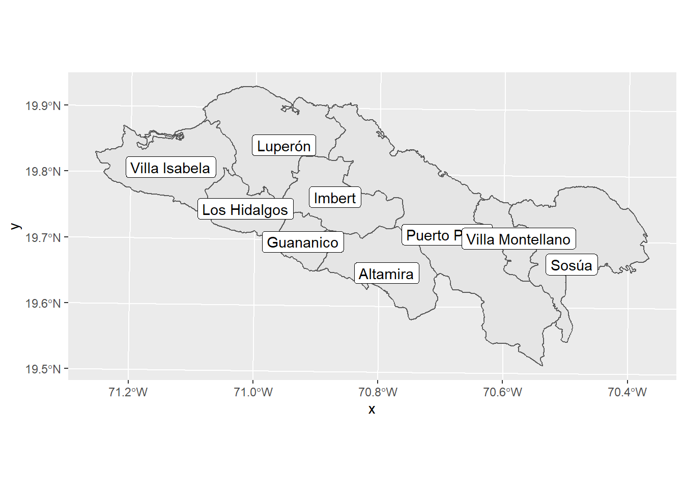
To avoid overlapping of the labels in the following maps, we are going to use the geom_label_repel from the ggrepel. This function place the labels with no overlaps at all.
This time let’s do the same map, but using Fidel’s specifications:
- Polygon’s fill and border color
- Label text color
- No background
- label box without outline
- plot border black
- legend within the plot area
map_puerto_plata %>%
  ggplot() +
  geom_sf(fill = polygons_fill, color = polygons_line) +

  # there is not a geom_sf_label_repel function, so we need to use
  # the basic one and add a few elements
  ggrepel::geom_label_repel(
    aes(label = municipio, geometry = geometry),
    stat = "sf_coordinates",
    min.segment.length = 0,
    label.size = NA, # with this we
    color = text_color
    ) +

  # Theme elements
  theme(
    axis.text = element_blank(),
    axis.ticks = element_blank(),
    panel.background = element_blank(),
    panel.border = element_rect(color = "black", fill = NA),
    panel.grid = element_blank()
    ) +

  labs(
    x = "",
    y = ""
  )
## old-style crs object detected; please recreate object with a recent sf::st_crs()
## old-style crs object detected; please recreate object with a recent sf::st_crs()
## old-style crs object detected; please recreate object with a recent sf::st_crs()
## old-style crs object detected; please recreate object with a recent sf::st_crs()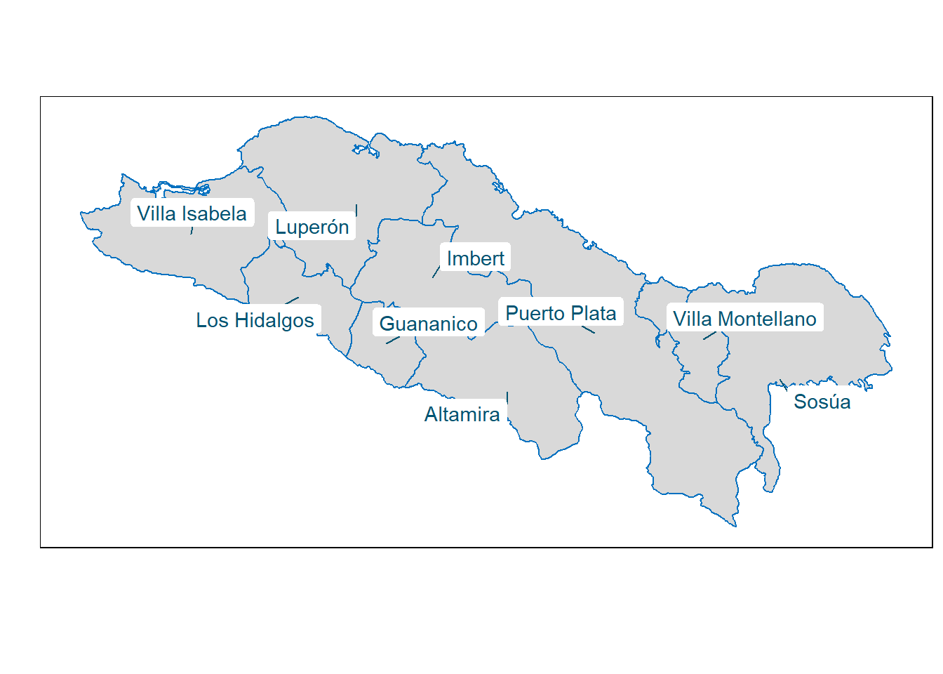
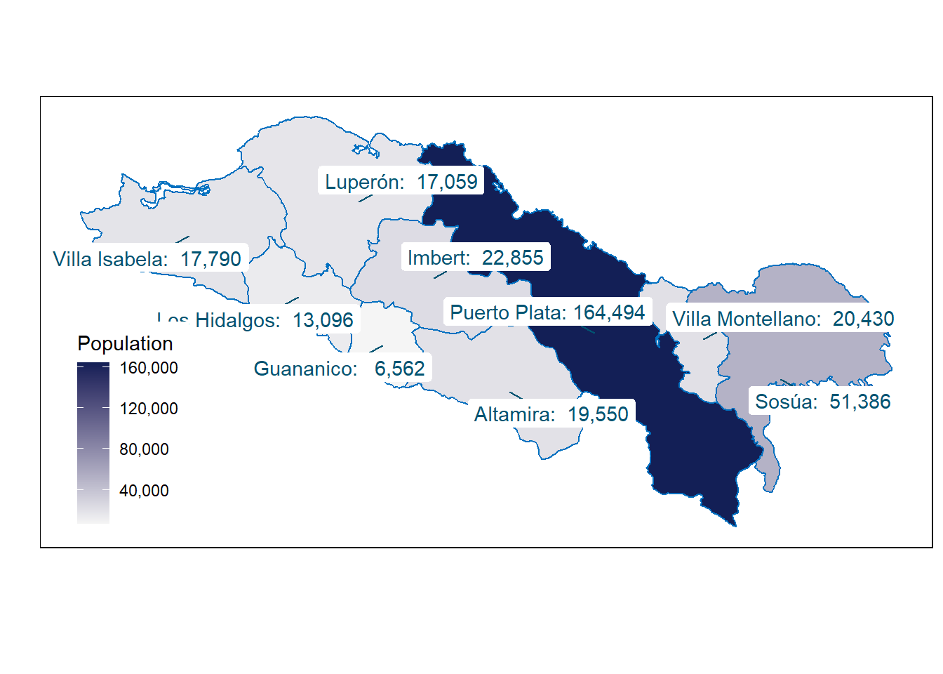
Finally, les’t fill the polygons with colors in a continuous scale base in a numeric variable (population). This time the label will display the population as well. To do this we just paste together the municipality and population.
map_puerto_plata %>%
  # mutating the population vairable to show big mark separator
  mutate(
    population = format(
      round(population_2018),
      big.mark = ",")
    ) %>%
  ggplot() +
  geom_sf(
    aes(fill = population_2018),
    color = polygons_line
    ) +
  ggrepel::geom_label_repel(
    # new labels: combination of population and the name
    aes(label = paste(municipio, population, sep = ": "), geometry = geometry),
    stat = "sf_coordinates",
    min.segment.length = 0,
    label.size=NA,
    color = text_color
    ) +
 # scale defined to fill the polygons base on a continuous
 # vairable
 polygons_fill_continuous +
 # Others theme aspect mentioned above
  theme(
    axis.text = element_blank(),
    axis.ticks = element_blank(),
    legend.position = c(.03, .03),
    legend.justification = c("left", "bottom"),
    panel.background = element_blank(),
    panel.border = element_rect(color = "black", fill = NA)
  )+
  labs(
    fill = "Population",
    x = "",
    y = ""
    )
comments powered by Disqus