Exploratory Data Analysis of Gas Prices in Brazil
Intention
I have been a kaggle member since 2017 and the analysis that this community share every day have been a good source of learning material in my data science journey. This time I decide to stop been a reader and share with you my first notebook.
The main intention of the notebook is to make an Exploratory Data Analysis of the Gas Prices in Brazil data set, hoping that new r users and kagglers in general could use this as a useful material to learn and apply in their own analysis.
English is not my native language, so, take this in consideration while reading my ideas.
Introduction
Brazil is the bigger oil producer in South America, and keeps a place between the top 10 producers in the world in 2018 (Source: Energy Information Administration). However, even the production level it has, the economy is not a net oil exporter, they have to import product to supply the national demand.
These facts makes oil prices in the country partially exposed to foreign shocks, that may be reflected in distortions in gas prices, with direct effects over the macroeconomic activity. Gas prices in any economy is an important variable correlated with the macroeconomic growth and general inflation levels.
This situation makes interesting an analysis of the evolution of gas prices in Brazil, using a data set with market prices and distribution prices of different product. In general, the analysis will cover a section oriented to import, transform and cleaning the data. Then, a data visualization exploration, finding trends, seasonality, distributions, etc.
The final topic will cover some modeling techniques, like exponential smoothing and least square to forecast the gas price evolution.
Packages
library(janitor) # data cleaning and tables
library(tidyverse) # metapackage with lots of helpful functions
library(lubridate) # to handle date objects in R
library(ggthemes) # themes for ggplot graphs
library(broom) # to handle models output in a tidy way
library(ggridges) # another tool to add elements to ggplot graphs
Importing and cleanign the data for analysis
This time the data comes in a .tsv format, which stands for Tab Separated Values. To import this type of text files the function read_delim() comes into play. This function, as the others in the readr package, has a better performance than their parallel in base R (read.table in this case) sice this provide a better automatic variable type identification, saving mutating code after importing the data.
run gas2 <- read.table("2004-2019.tsv", sep = "\t", header = TRUE) an compare the results.
gas <- read_delim("data/2004-2019.tsv", delim = "\t")Before showing the results of the data importing process, it is important to tune a bit the names of the variables in the gas data frame. This job was not automatic and consisted in writing by hand a short English translation of the names in Portuguese.
# This asignation structure helps when trying to sabe space in the cell

new_variables_names <-  c("x", "initial_date", "end_date", "region", "state",
  "product", "stations_consulted","unit", "mean_market_price",
  "sd_market_price", "min_market_price", "max_market_price",
  "mean_price_margin", "cv_market_price", "mean_distribution_price",
  "sd_distribution_price", "min_distribution_price",
  "max_distribution_price", "cv_distribution_price", "month", "year")

names(gas) <- new_variables_names

# I want a moth variable with labels, not only numbers
gas <- gas %>%
mutate(month_label = month(initial_date, label = TRUE))
Done that, taking a glimpse of the data shows that all variables were import with a correct format. For example, dates were automatically parse as date.
glimpse(gas)## Rows: 106,823
## Columns: 22
## $ x <dbl> 0, 1, 2, 3, 4, 5, 6, 7, 8, 9, 10, 11, 12, 13, ~
## $ initial_date <date> 2004-05-09, 2004-05-09, 2004-05-09, 2004-05-0~
## $ end_date <date> 2004-05-15, 2004-05-15, 2004-05-15, 2004-05-1~
## $ region <chr> "CENTRO OESTE", "CENTRO OESTE", "CENTRO OESTE"~
## $ state <chr> "DISTRITO FEDERAL", "GOIAS", "MATO GROSSO", "M~
## $ product <chr> "ETANOL HIDRATADO", "ETANOL HIDRATADO", "ETANO~
## $ stations_consulted <dbl> 127, 387, 192, 162, 103, 408, 278, 105, 125, 4~
## $ unit <chr> "R$/l", "R$/l", "R$/l", "R$/l", "R$/l", "R$/l"~
## $ mean_market_price <dbl> 1.288, 1.162, 1.389, 1.262, 1.181, 1.383, 1.45~
## $ sd_market_price <dbl> 0.016, 0.114, 0.097, 0.070, 0.078, 0.132, 0.21~
## $ min_market_price <dbl> 1.190, 0.890, 1.180, 1.090, 1.050, 0.999, 1.03~
## $ max_market_price <dbl> 1.350, 1.449, 1.760, 1.509, 1.400, 2.050, 1.95~
## $ mean_price_margin <chr> "0.463", "0.399", "0.419", "0.432", "0.24", "0~
## $ cv_market_price <dbl> 0.012, 0.098, 0.070, 0.055, 0.066, 0.095, 0.15~
## $ mean_distribution_price <chr> "0.825", "0.763", "0.97", "0.83", "0.941", "0.~
## $ sd_distribution_price <chr> "0.11", "0.088", "0.095", "0.119", "0.077", "0~
## $ min_distribution_price <chr> "0.4201", "0.5013", "0.5614", "0.5991", "0.744~
## $ max_distribution_price <chr> "0.9666", "1.05", "1.161", "1.22242", "1.0317"~
## $ cv_distribution_price <chr> "0.133", "0.115", "0.098", "0.143", "0.082", "~
## $ month <chr> "05", "05", "05", "05", "05", "05", "05", "05"~
## $ year <dbl> 2004, 2004, 2004, 2004, 2004, 2004, 2004, 2004~
## $ month_label <ord> May, May, May, May, May, May, May, May, May, M~Another useful translation would be to change the content of region and product variables. Changing the variable state is not an option here because these are given names.
gas <- gas %>%
mutate(product = recode(product, "ETANOL HIDRATADO" = "Hydrated Ethanol",
                       "GASOLINA COMUM" = "Gasoline", "GLP" = "LPG",
                       "GNV" = "CNG", "ÓLEO DIESEL" = "Diesel Oil",
                       "ÓLEO DIESEL S10" = "Diesel S10"),
      region = recode(region, 'CENTRO OESTE' = 'West Center',
                      'NORDESTE' = 'Northeast', 'NORTE' = 'North',
                      'SUDESTE' = 'SouthEast', 'SUL' = 'South'),
      floor_date = floor_date(initial_date, "month"))
Data visualisation
In general, gas prices in Brazil have shown an upward trend as the one observe in the global oil market in the last decade. On average, the mean market price of all type of gas in Brazil changed in a rate of 6% yearly. The Compressed Natural Gas was the fuel with the higher variation (7.3% every year, on average).
Table 1: Market prices variation
# Code for the task
gas %>%
group_by(year, product) %>%
summarise(mean_price = mean(mean_market_price, na.rm = TRUE)) %>%
group_by(product) %>%
mutate(lag = lag(mean_price),
      variation = ((mean_price - lag)/ lag)*100) %>%
select(-mean_price, -lag) %>%
mutate_if(is.numeric, round, digit = 2) %>%
spread(product, variation)
## # A tibble: 16 x 7
## year CNG `Diesel Oil` `Diesel S10` Gasoline `Hydrated Ethanol` LPG
## <dbl> <dbl> <dbl> <dbl> <dbl> <dbl> <dbl>
## 1 2004 NA NA NA NA NA NA
## 2 2005 7.59 14.3 NA 8.85 11.3 -1.52
## 3 2006 11.7 8.07 NA 8.93 15.7 6.15
## 4 2007 7.12 -0.6 NA -1.96 -11.0 2.18
## 5 2008 12.7 8.42 NA 0.09 1.16 0.67
## 6 2009 3.57 1.46 NA 0.28 0.03 5.51
## 7 2010 -1.01 -2.27 NA 1.89 9.25 5.72
## 8 2011 0.56 1.04 NA 4.5 13.8 1.36
## 9 2012 4.76 2.48 NA 0.07 1.03 2.3
## 10 2013 4.71 10.9 11.4 4.76 3.95 5.65
## 11 2014 5.32 8.23 8.48 4.07 5.63 6.05
## 12 2015 9.71 12.9 12.4 12.7 7.23 12.6
## 13 2016 9.36 7.53 6.9 9.58 19.2 11.9
## 14 2017 3.78 2.87 2.47 1.75 1.71 9.26
## 15 2018 15.3 12.1 10.7 16.5 7.81 15.4
## 16 2019 14.4 2.05 1.72 -1.05 1.09 1.3The evolution of prices in all regions was not equal, even though the general trend for all was positive. The regional disaggregation shows that prices in the North region had the higher volatility, especially over CNG prices.
Another aspect is that prices in West Center and North regions are over the prices in the others. This element demand a comparison between selling margins in the diferent areas, to see if prices in these regions are higher because of a higher margin or due to cost structure.
Plot 1. Evolution of gas prices by product and region
# Code for this task
gas %>%
group_by(year, month, initial_date, region, product) %>%
summarise(mean_market_price = mean(mean_market_price, na.rm = TRUE)) %>%
ggplot(aes(x = initial_date, y = mean_market_price, color = region)) +
geom_line() +
facet_wrap(~product, scale = "free") +
theme(legend.position = "bottom") +
scale_colour_hue(l = 40, c = 30) +
ggthemes::theme_fivethirtyeight() +
labs(y = "US$")
## `summarise()` has grouped output by 'year', 'month', 'initial_date', 'region'.
## You can override using the `.groups` argument.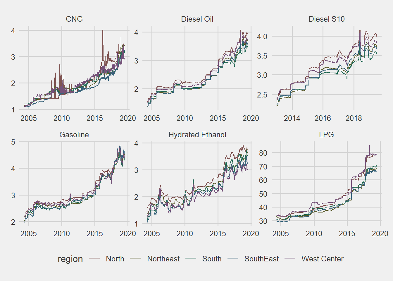
Margins distributions by region and product
- Camparign margins in all regions shows that CNG has the higher one.
gas %>%
#group_by(year, month, floor_date, region, product) %>%
#summarise(mean_market_price = mean(mean_market_price, na.rm = TRUE)) %>%
filter(!product == "LPG") %>%
ggplot(aes(x = mean_price_margin, fill = product, color = product)) +
geom_density(alpha = 0.15) +
scale_colour_hue(l = 40, c = 30) +
facet_wrap(~region, scales = "free_y") +
theme(legend.position = "bottom") +
theme_fivethirtyeight()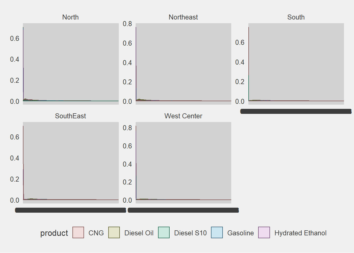
#coord_flip()Seassonality
This type of data with monthly frequency usually brings seasonal patterns that are important to be detect. In this case, we are going to explore seasonality with a graph. This graph in particular shows a line for each year, where months are map to one of the axis, allowing us to see is a cycle repeat over the different lines.
In general, there is not a clear cycle in the different variables, but anyway two things can be Highlighted.
- Diesel prices tend to increase more rapidly in the last quarter of the year.
- Hydrated Ethanol prices tend to increase more rapidly in the first quarter of the year.
Plot 3. Seassonal plot
gas %>%
group_by(year, month_label,  product) %>%
summarise(mean_market_price = mean(mean_market_price, na.rm = TRUE)) %>%
ggplot(aes(x = month_label, y = mean_market_price, color = year, group = year)) +
geom_line() +
facet_wrap(~product, scales = "free") +
theme_fivethirtyeight() +
theme(legend.position = "bottom",
     axis.text.x = element_text(angle = 90, size = 9),
     panel.grid = element_blank(),
     legend.text = element_text(size = 7))
## `summarise()` has grouped output by 'year', 'month_label'. You can override
## using the `.groups` argument.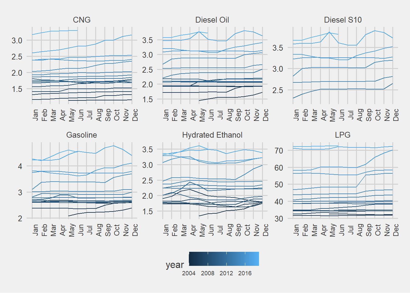
Trend and slope of the evolution
Since the beginning of the notebook the existence of a positive trend in the evolution of the prices was mention in different parts, but now it is time to describe that trend and with a linear regression explore the slope by fuel in each region.
Previously, a line plot of mean market price was shown, where the mean appear without any element related to the dispersion of the different prices. This time a hexagonal plot shows the trend that we mention before, isolated by different facets. A hex plot was use because it is easier to show the concentration and distribution of the prices than using points with low opacity.
With this analysis emerged a few insights:
- The Ethanol was the fuel with the lower slope and higher variance
- Diesel S10 was the one with the higher variation.
- Compressed Natural Gas has a low share in the north region. In addition, there are some states in this region that bought CNG different moments but it have not been adopt as a frequent source of energy.
- In the West Center region, the price of Liquefied petroleum gas (LPG) has a clear variation by state, evidence in the different branches of the hexagons. I did not include color by state in this visualization, but I did the homework and a different trend within the region explains those branches.
gas %>%
    ggplot(aes(x = initial_date, y = mean_market_price)) +
    geom_hex(show.legend = F) +
    #geom_point(alpha = 0.09, size = 0.1) +
    facet_grid(product~region, scales = "free") +
    theme(legend.position = "none") +
    theme_fivethirtyeight() +
    theme( axis.text.x = element_text(angle = 90))
## Warning: Computation failed in `stat_binhex()`:
##
## Computation failed in `stat_binhex()`:
##
## Computation failed in `stat_binhex()`:
##
## Computation failed in `stat_binhex()`:
##
## Computation failed in `stat_binhex()`:
##
## Computation failed in `stat_binhex()`:
##
## Computation failed in `stat_binhex()`:
##
## Computation failed in `stat_binhex()`:
##
## Computation failed in `stat_binhex()`:
##
## Computation failed in `stat_binhex()`:
##
## Computation failed in `stat_binhex()`:
##
## Computation failed in `stat_binhex()`:
##
## Computation failed in `stat_binhex()`:
##
## Computation failed in `stat_binhex()`:
##
## Computation failed in `stat_binhex()`:
##
## Computation failed in `stat_binhex()`:
##
## Computation failed in `stat_binhex()`:
##
## Computation failed in `stat_binhex()`:
##
## Computation failed in `stat_binhex()`:
##
## Computation failed in `stat_binhex()`:
##
## Computation failed in `stat_binhex()`:
##
## Computation failed in `stat_binhex()`:
##
## Computation failed in `stat_binhex()`:
##
## Computation failed in `stat_binhex()`:
##
## Computation failed in `stat_binhex()`:
##
## Computation failed in `stat_binhex()`:
##
## Computation failed in `stat_binhex()`:
##
## Computation failed in `stat_binhex()`:
##
## Computation failed in `stat_binhex()`:
##
## Computation failed in `stat_binhex()`:
Now I will apply an approach from book “R for Data Science”, in order to run many models at once for each strata. The strategy to accomplish this is to nest the data with tidyr, ending with a data frame of data frames called by_region_product, then mutating each DF to end with a model.
Having the models we can extract information about the coefficients (standar error, p.values) and about the individual observations (residuals).
# Using nest function from tidyr to create a data set of data set with the diferent strata
by_region_product <- gas %>%
mutate(period_change = as.numeric(round((min(initial_date) - initial_date)/30, 0)) * -1) %>%
group_by(region, product) %>%
nest()

# adding a linear model and some summary statistics about them
by_region_product <- by_region_product %>%
mutate(price_lm = map(data, ~lm(mean_market_price ~ period_change, data = .x)),
      glance = map(price_lm, glance),
      tidy = map(price_lm, tidy),
      augment = map(price_lm, augment),
      rsq = map_dbl(glance, "r.squared"))

# Plot of the slopes colored by the fit indicador Rsquared
by_region_product %>%
unnest(tidy) %>%
select(region, product, rsq, term, estimate) %>%
  spread(term, estimate) %>%
rename(intercept = `(Intercept)`) %>%
filter(!product == "LPG") %>%
mutate(producto = factor(product),
      producto = fct_reorder(product, rsq)) %>%
ggplot(aes(y = product, x = period_change, color = rsq)) +
geom_point() +
facet_wrap(~region, scale = "free_x") +
theme_fivethirtyeight() +
theme(legend.position = "bottom",
     axis.text = element_text(size = 8),
legend.text = element_text(size = 8)) 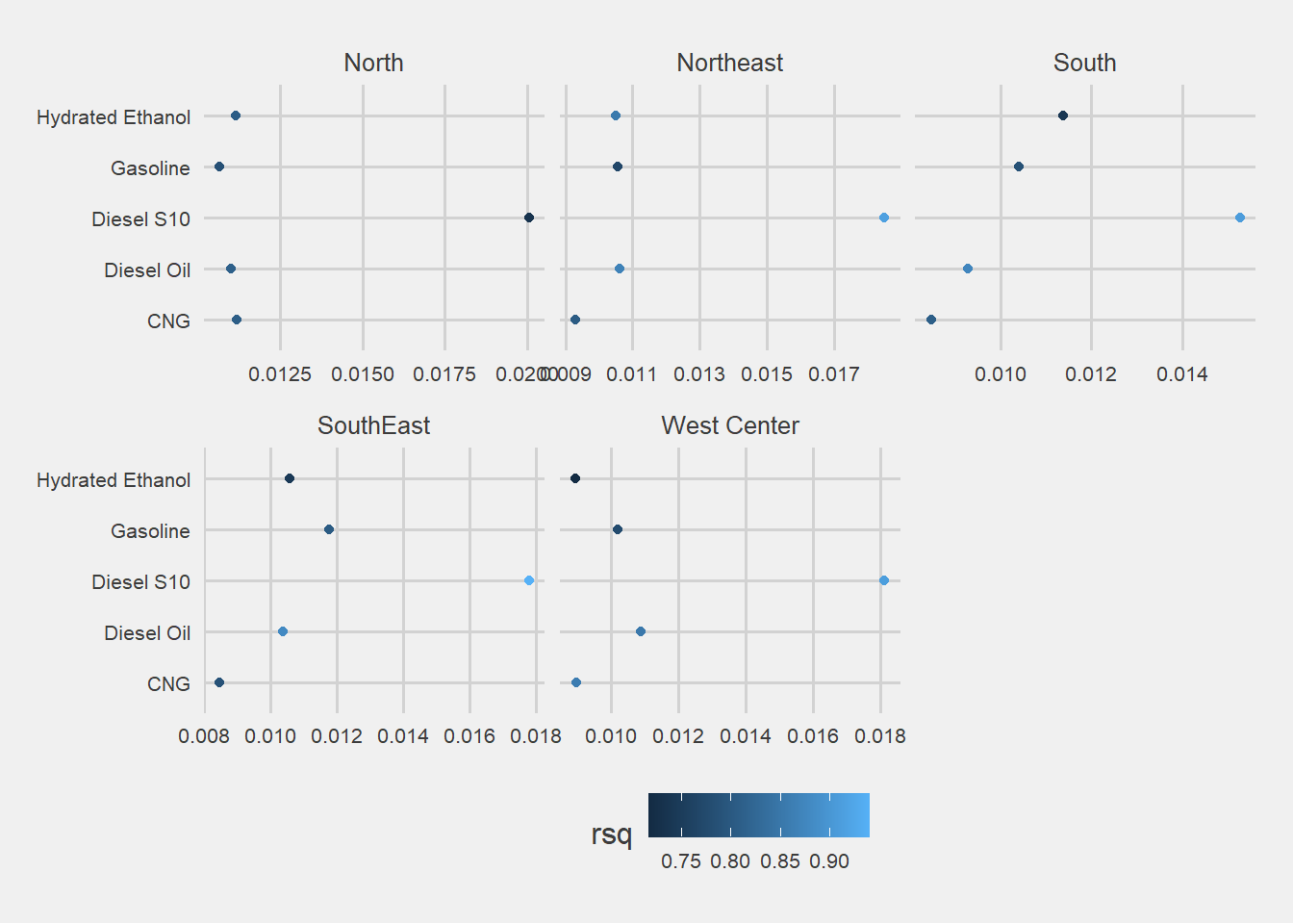
comments powered by Disqus